Unleash Limitless Business Growth with the Power of Numerology and Vastu
Transform your business into a magnet for success, harmony and abundance by aligning with universal energies
₹499/- Now ₹50/-
30 mins one on one consultation

Why Numero-Vastu or Numerology & Vastu is the game changer for your business growth ?
Your business name, logo, visiting card, mobile number and office layout are more than just elements—they’re energy amplifiers. Numerology and Vastu help align these aspects with universal forces to:
- Attract high-value clients and profitable opportunities.
- Enhance workplace harmony and employee productivity.
- Create a brand identity that resonates with success
Business leaders across industries are already using these tools to stand out in competitive markets. Don’t let outdated practices hold your business back.
This offer only for Today.......
What’s Holding Back Your Growth?
- Struggling to find loyal and productive employees.
- Inconsistent revenue and poor profitability.
- A lack of brand visibility and recognition.
- Business workplace energy that feels chaotic or unproductive.
- Employees are not aligned with their correct departments as per their date of birth.
These issues often created from misaligned energies in your business. Numerology and Vastu offer solutions that are rooted in both science and spirituality, guiding you to make powerful changes that yield tangible results.
This offer only for Today.......
See how a logo change can lead to massive success
Airtel (India)
Logo Change
● Airtel revamped its logo in 2010, adopting a curved, dynamic red symbol and a modern font.
The curvature and modern style reflected innovation, rapid growth and adaptability.
Result
Airtel solidified its position as a global telecom leader, and the refreshed identity resonated with younger audiences, enhancing brand recall and loyalty.
Pepsi (Global)
Logo Change
● Pepsi redesigned its logo in 2008, adopting a circular shape with a dynamic wave and balanced colors.
● The dynamic wave infused vibrancy, symbolizing flow and adaptation.
Result
The brand saw increased global visibility, with younger demographics engaging more with the revamped identity.
YES BANK
Logo Change
- The iconic tick mark was reimagined as a soaring bird, symbolizing the bank’s progressive spirit and current position of ‘soaring’.
- The design adopted smoother corners and fluid shapes, replacing the previous angular edges, to convey a sense of fluidity and modernity.
- Following a difficult phase in its history, the new logo symbolizes YES BANK’s recovery, innovation, and commitment to security. This change aimed to instill greater trust and confidence in both existing and potential customers.
Result
By moving away from a rigid, more corporate look to a more dynamic, fluid visual, the logo aligns the bank with modernity and forward-thinking principles.
How Vastu-Compatible Scientific Logo Redesign Can Help Your Brand
Aligning logos with Vastu principles amplifies positivity, attracts the right customers, and aligns your business energy with growth. For instance:
- Shapes: promote stability and balance.
- Colors harmonize energy based on industry elements
- Placement ensures flow and accessibility.
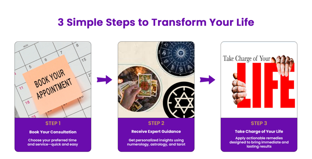
3 Simple Steps to Transform Your Life

This offer only for Today.......
What you will get from Us
We don’t just provide predictions—we deliver transformative results. Our personalized consultations are designed to address your unique business challenges and pave the way for success. Here’s how we make a difference.......
- Tailored Solutions: We create customized strategies to align your business for maximum growth.
- Professional Expertise Our team consists of Professional Numerologists & Vastu experts.
- Proven Accuracy: We offer precise, actionable insights based on years of expertise.
- Holistic Results: Addressing challenges from every angle, we provide Advance level personalised remedies.
With OUR TEAM
Other Platforms
- ✅ Transparent, all-inclusive pricing—no hidden costs or per-minute charges.
- ✅ Expertise from certified and experienced Numerologists.
- ✅ Focused on your long-term success with reliable and accessible solutions.
- ❌ May charge high per-minute fees, making services expensive.
- ❌ Risk of consulting unqualified or inexperienced individuals.
- ❌ Limited engagement, often cutting off once the session ends.
This offer only for Today.......
Meet Your Numero Vastu Experts

Vertika Misra
Vastu & Business Energy Alignment Specialist
A pioneer in Scientific Logo Designing and Visiting Card Designing as per Vastu Principles, Vertika Misra empowers businesses to harness positive energies for sustained growth and success. Her expertise in Business Numerology, Vastu compatible scientific logo designing and Visiting card design, Business Name design,Crystal Healing, and Tarot reading ensures holistic solutions for personal and professional transformations. With her strategic approach, Vertika helps individuals and enterprises unlock prosperity by aligning their brand identity with cosmic energy flows, having successfully supported more than 600 business entities.
Acharya Rajan
Business Numerology Expert & Life Designer
Acharya Rajan is a distinguished Business Numerology Expert and Life Coach, guiding individuals and enterprises toward growth and success through strategic energy alignment. With a deep understanding of Personalized and Customized Remedies, he crafts tailored solutions that empower businesses to unlock their true potential and achieve lasting success.
His proven expertise in Business & Mobile Numerology, Crystal and Rudraksha Remedies, Ramal Vigyan, Lal kitab and numerological strategies for life design ensures a holistic approach to transformation. Acharya Rajan’s insightful guidance helps clients overcome challenges, align with positive energies, and create a path toward personal and professional fulfillment. Transformed more than 10000 lives through healing and spiritual guidance.
This offer only for Today.....
Frequently Asked Questions
Numerology and Vastu identify the energetic alignment of your business name, logo, work space and other critical factors, offering remedies to enhance success and productivity.
Any industry—from startups to large-scale enterprises—can benefit from Numerology and Vastu alignment.
Most remedies are simple, cost-effective, and easy to implement, tailored to your specific needs.
While some results are immediate, full transformation depends on the scope of changes implemented.
You don’t have to believe; the results speak for themselves. Many of our clients were skeptics until they witnessed the growth firsthand.